We recently reshuffled a few of our kids rooms around. Our teenage girl had painted her room a light green and applied the Polka Dot set from Inspirations Wall Art. She moved to a different room and we moved our 2 yr old and 5 yr old into this room. We decided not to repaint, but just give it a quick makeover, so we simply removed the words like; laugh, believe, love, etc from the Polka Dot set leaving the dots and rings and then added the Space Set (also from Inspirations Wall Art .com) The space set is different from the usual vinyl in that it is printed full color vinyl. It’s just as simple to put up, see the picture of my 5 yr old helping to remove the transfer tape. We then added a Rocket Growth Chart, available from the same company) – measure twice, stick once and BOOM BABY ! we were done!
The whole project took less than a half hour and it looks great.


Guitar Room Makeover
Posted on: November 12, 2010
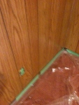


We recently decided to makeover my 10 year old son’s room. It is in the basement, has one small window and had dark wooden paneling from the 70’s…time for change!
We opted for a light blue color, light enough to reflect the limited light , brighten the room and make it appear larger, but dark enough not to be a “baby blue”. This was a fairly lengthy job as we had to cover the dark grained hardboard walls with two coats of white before we could applied two coats of the blue. Of course we needed to tape off the ceiling, doors, window frame and base boards first, remove the covers from the light switch and electrical outlets and cover the carpet in plastic. The kids helped with the painting and it took a few days to get it all done.
We wanted to apply some vinyl decals, but it is recommended that you allow fresh paint to dry and harden off for at least two weeks before doing this. We happened to be going away for a week, so when we got back we decided to risk it.
We had picked out a really cool large guitar player in black and a polka squares set in blue and chocolate, from Inspirationswallart.com. They have a huge selection for just about anything you could want. They do graphics as well as quotes.
The large guitar player came in several pieces but was really easy to put together. We choose to not use all the words from the polka squares set, as my son felt some were a bit too girly like “Love” but others he thought were cool. The vinyl really made the room and I think the guitar player is the focal point as you walk in. My son thinks he’s the luckiest kid in the world and loves his new room. (He even makes his bed every morning without being reminded!)
The whole project has made a huge difference to this room and inspired me on to do more in the rest of the house.
We have so many inquires about our best selling removable vinyl wall art. So for your reading pleasure, here are our top 10:
 We call this the Polka Dot Set, well… it is quite self explainatory.

The wall art saying read as follows: Within these walls – we laugh the most and love the best.
Click here to check it out
 The wall art saying read as follows: The greatest happiness in life is to Love and be Loved, with “FAMILY” in silver.
 The wall art saying read as follows: My favourite place is inside your arms
 The wall art saying read as follows: With a butterfly kiss and a lady bug hug Sleep tight little one, like a bug in a rug
 Another self explanatory one… The Football Set!
 The wall art saying read as follows: A house is made of walls & beams A Home is made of Love & Dreams
 The wall art saying read as follows: We don’t remember the days
We remember the moments
 Well, what else can I say… This is so cute.
Click here to check it out
 The wall art saying read as follows: Dance like nobody’s watching Sing like nobody’s listening
Well, it’s that time of the year… It’s Christmas!!! (Well, almost)
At Inspirations Wall Art, while we are busying working, we are also celebrating the upcoming holiday. Of course, what else can we do but to celebrate the Christmas spirit WITH vinyl wall art!!! We have a special category called “religious wall art“. Here are a couple samples:

Christmas removable wall art (Click here to visit)

To Etch or NOT to Etch
Posted on: November 2, 2008
We have a really cool new type of vinyl. It’s called “Etched” vinyl and comes in either a silver or gold color. It’s used on glass or mirror and it quite literally looks like the design has been etched or sand blasted into the surface of the glass. Very cool! Here’s a picture of what the “Etched” vinyl looks like:

We’ve used it a little (It’s about 4 times the price of normal vinyl!), in designs like I-086 Springtime Set and I-090 Christmas Set and it’s been a big hit.
The springtime set consists of flowers and butterflys, bees and lady bugs. We done parts of the set in the silver etched, so that when decorating a room, the design can flow from the walls across either a mirror or a window. It looks really fun! Click here to view the wall art
On the Christmas Set, it’s obviously more formal and so we used the gold etched. We’ve displayed it on mirrors (pick something inexpensive up at Walmart), so that it can be used from year to year. I’ve also seen it applied onto windows which looks awesome. Click here to view the wall art
On cars it’s translucent (almost see through, for those of you who are vocab challenged), and looks very classy.
We’re thinking of creating a range to be applied to windows (think old style Victorian designs) and glass screen doors, perhaps car windows etc, but perhaps the market is too small to warrant it. New designs are time consuming to create, so we need a certain volume to make it worthwhile. Give us your feedback and/or design ideas.
Paint tip
Posted on: October 20, 2008
OK, so you’ve decided to refresh your decor. Paint is definitely one of the cheapest and most effective ways to do this, but selecting the color or colors does create some challenges and should not be done in haste. Remember you will have to live with this ….or you’ll be repainting sooner than you’d hoped!
OK so; “How do I choose a color?”
Well there are a few simple things to decide on first. What color pallet do you like? Blue, Greens, (Cool colors) or Reds, yellows, browns (warm colors). Your choice will greatly effect the “Feel” of the room in terms of temperature and mood. Without getting into too much psychological mumbo jumbo – cool colors will make a room feel cool and calming, while warm colors (reds etc) will be more stimulating generally speaking.
Color will also effect our perception of the size of the room. Lighter colors will make a room feel bigger and darker colors smaller.
So decide what you want. Cool or warm, relaxing or stimulating, bigger or smaller (cozy).
OK so lets assume you’re painting a long hallway and you want to make this narrow space feel bigger and brighter – you want something from the yellow range. This would include: yellows, gold, creams, beige, tans etc.
Get down to your local paint store and select some color swatch cards. These are usually free. Or you can look online, to get a basic idea, but I still suggest getting an actual swatch so you can see what the color will look like in the intended room.
Look at the swatches in the actual room, firstly under natural light and secondly with the lights on. This will give you a better idea of what the color will look like under different lighting. Yes they change!
Make your choice and hussle down to the store to buy a quart of the best quality paint. Don’t skimp on quality, you will regret it – lots more work and yes you can tell the difference. Now test the color on the wall, painting a few test patches on different walls if possible. When the paint dries, take a look at it under different lights, morning, afternoon and evening, lights on, lights off.
This will be the definitive test as to if this paint is right for you!
Good luck and have fun!
